CLEITON FUHR

Florybal Rebranding
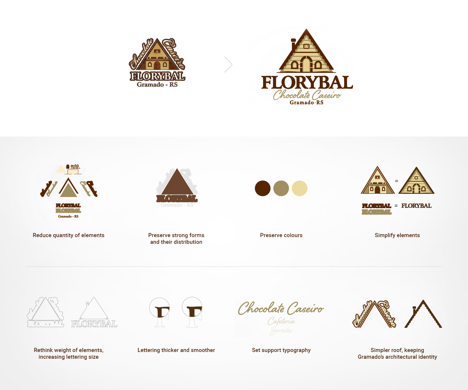
After going through many business phases, Florybal was in need of a rebranding, which, although extremely traditional, no longer complied with what Florybal represents nowadays in terms of product, innovation and quality. A brand well-known in the market must be respected and updated without losing its recognition. Therefore, it was crucial to respect a few symbols and elements already recognized by the general public and to simplify them through a drastic reduction of details. Another purpose was to carefully refine the 'FLORYBAL' lettering and set a unique typography full of personality for the 'Homemade Chocolate' sub lettering, which from this moment on, started to be incorporated in the brand's collateral materials. As a result, we reached a modern brand with traces of local remembrance without losing its incredible history and strong brand recognition.


